By Troy Wolverton
BlackBerry’s new Z10 is the company’s closest thing to an answer to Apple’s iPhone and smartphones running Google’s Android, but the long-awaited phone offers little to lure users of those devices.
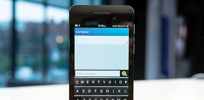
The Z10 takes its design and interface cues from other contemporary smartphones. Like many of its rivals, it’s a thin, black slab built around a large touch screen.
It’s got a new operating system designed for touch-screen devices, and its key features resemble those of the latest iPhone and Android devices. It’s got a built-in application store, front and rear cameras, a high-resolution display, the ability to switch quickly between multiple apps, and an LTE radio to connect to wireless carriers’ new, high-speed networks.
BlackBerry has made much of the Z10’s new and different interface. But it feels like it’s been cobbled together from pieces of other operating systems. It has an app grid that looks and acts like the ones you’ll find in Apple’s iOS or Android. It has a screen of running applications that’s very similar to the one shown on Windows Phone devices.
And a feature called BlackBerry Hub, which is essentially both a universal inbox and notification centre, isn’t all that different from the notifications areas on Apple and Android phones.
One thing that is different on the Z10 is that it has neither a physical nor virtual home button. To get back to the home screens from an application, you have to swipe up from the bottom of the display.
The advantage of this approach is that you can check for new messages without leaving your current application by doing a partial swipe. Or, by combining a swipe upward with one to the right, you can go directly from your current application to the Hub.
But these features aren’t much different from pulling down the notification shade on an iPhone or Android device. And on those devices, you can go directly from an app to a particular message or alert — something you can’t do on the Z10.
One cool Z10 feature is an updated version of the iPhone’s autocorrect system. As you type, the Z10’s keyboard offers word suggestions, positioning those choices above various letters on the keyboard. To choose one, you simply swipe up from the letter below it.
The more you use the Z10, the better it is supposed to understand your personal lexicon, allowing it to better predict the words you want to type. I found the feature to work pretty well and was typically more accurate than the often aggravatingly inaccurate version on my iPhone.
But as much as the Z10 has tried to copy and improve upon the success of the iPhone and Android devices, there are ways it just doesn’t measure up.
For one thing, it’s buggy. Several times while trying to select a word on the keyboard, I ended up back at the home screen instead. I tried numerous times to initiate a call using the phone’s voice-control feature while connected to the hands-free system in my Prius, but without success; the phone kept canceling the call.
The built-in turn-by-turn navigation system crashed at least once while I was using it. And even when it worked, the navigation feature can only be used in portrait mode; it doesn’t adjust its orientation when you turn your phone on its side.
But the bigger problem with the Z10 is the paucity of applications available for it. BlackBerry says that you’ll now find 100,000 apps in the BlackBerry World store. But from my observation, the vast majority of those apps are junk. And the store lacks many of the most popular smartphone apps, including Pandora, Spotify, Netflix, Hulu, Skype and Gmail. In fact, of the top 10 paid apps in the iPhone App store, just two — WhatsApp Messenger and “Angry Birds: Star Wars” — are available for the Z10.
To be sure, many of these apps may end up on the Z10 over time. BlackBerry representatives said they expect some to show up in coming weeks.
But even if they do, there’s little about the Z10 that would encourage someone with an iPhone or Android device to switch. BlackBerry may have checked the feature boxes, but it hasn’t created something that offers anything that’s terribly unique or compelling. — San Jose Mercury News/MCT
In a nutshell
In a nutshell
Likes: High resolution screen, refined autocorrect system, includes many of the features found on rival devices, thin and sleek design.
Dislikes: Paucity of apps, numerous bugs, lack of a home button, lack of compelling or unique features, interface feels cobbled together.
Specs: Dual-core, 1.5GHz processor; 4.2-inch, 1280 x 768 pixel display; 16GB of storage; 2-megapixel front and 8-megapixel rear cameras.
Web: www.blackberry.com

* The Z10 takes its design and interface cues from other contemporary smartphones.
