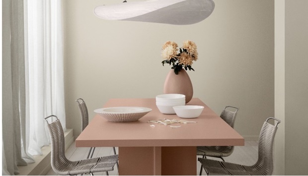
When humans connect, we create something unique and precious. Jotun believes the same is true for colour. After more than a year of being apart, many of us around the world are starting to come together once more, finding joy in shared moments and spaces. The warmth and resonance of this reconnection has inspired Jotun’s new Global Colour Card for 2022.
Titled TOGETHER, the colour card comprises three unique and carefully curated colour schemes designed to help create distinctive spaces where we can enjoy being together again, celebrate meaningful moments, and allow ourselves to be playful and creative.
‘Colours influence our wellbeing. They can calm us down, soothe our worries or kick-start our creativity. At Jotun, we are fascinated by how the colours that we surround ourselves with can shape our everyday lives.’ – Lisbeth Larsen, Global Colour Manager at Jotun
TOGETHER contains 12 beautiful brand-new colours, presented in combination with timeless shades selected from Jotun’s rich colour archives. The 28 colours are grouped into three distinct palettes. Named Embrace, Playful and Cherish, each one captures a different facet of our desire to reconnect – with others, with ourselves and with our creativity.
1. EMBRACE – Make space for moments that matter
Natural colours make room for unique moments to unfold, and memories to take shape.
Happy memories can be brought back to mind through colour. A soft shade of golden beige might be enough to return you to your grandmother’s kitchen. A particular blue-grey hue might evoke the seaside holidays of your childhood. EMBRACE features colours that encourage the mind to wander back in time and find comfort in moments from our past.
EMBRACE also includes rustic shades of earth and stone that encourage us to slow down and ground ourselves in the present, to feel safe in simplicity. By dynamically combining colours, mingling present and past, EMBRACE allows for the creation of soft, harmonious, and deeply welcoming atmospheres.
The Palette | Rustic, raw and honest


2. PLAYFUL – Freedom to be bold and creative
Combined with flair and confidence, these colours grab hold of the senses and spark joy. Dream big; let colour in.
PLAYFUL is a palette of powerful colours filled with hope and optimism. It provides an opportunity to be bold, to unleash one’s creativity and experiment with new colour combinations.
The impulse to express ourselves with vibrant colours and give our homes a more daring and personal touch has grown stronger as we have spent more time indoors. Vivid shades such as turquoise and ocean green, sunlight yellow, and shades of uplifting lavender shape bold and surprising spaces that nourish creative energy.


3. CHERISH – SPACE TO REFLECT, RESTORE AND RECONNECT
Soft, soothing colours create the perfect space for contemplation and reflection
Gentle earth tones and neutrals create an environment where body and mind feel connected, balanced and content. In times of uncertainty, soft, natural colours remind us that our home is the anchor of our lives, our shelter and haven.
CHERISH is characterised by calming, pleasant colours. It is both bright and restrained, creating a space that is warm, enveloping and safe. When combined with airy textiles and soft surfaces, the palette generates a serene atmosphere that gives you space to reconnect.
The Palette | Discreet, Elegant and Enveloping


‘Our colour choices are always personal, and the most important thing is that you choose the colours you know will bring you joy. Use our colours to create the mood you dream of, whether its soothing and calming or upbeat and energetic. The choice is all yours.’ – Lisbeth Larsen, Global Colour Manager at Jotun

